THE FRUIT BOX
A hand-drawn identity built to stand out on a crowded beach
Context
The Fruit Box is a seasonal fruit and smoothie stand at Woodbine Beach in Toronto, operated by Pegasus Group of Restaurants. The goal was a brand that felt fresh, fast, and impossible to miss.
the Challenge
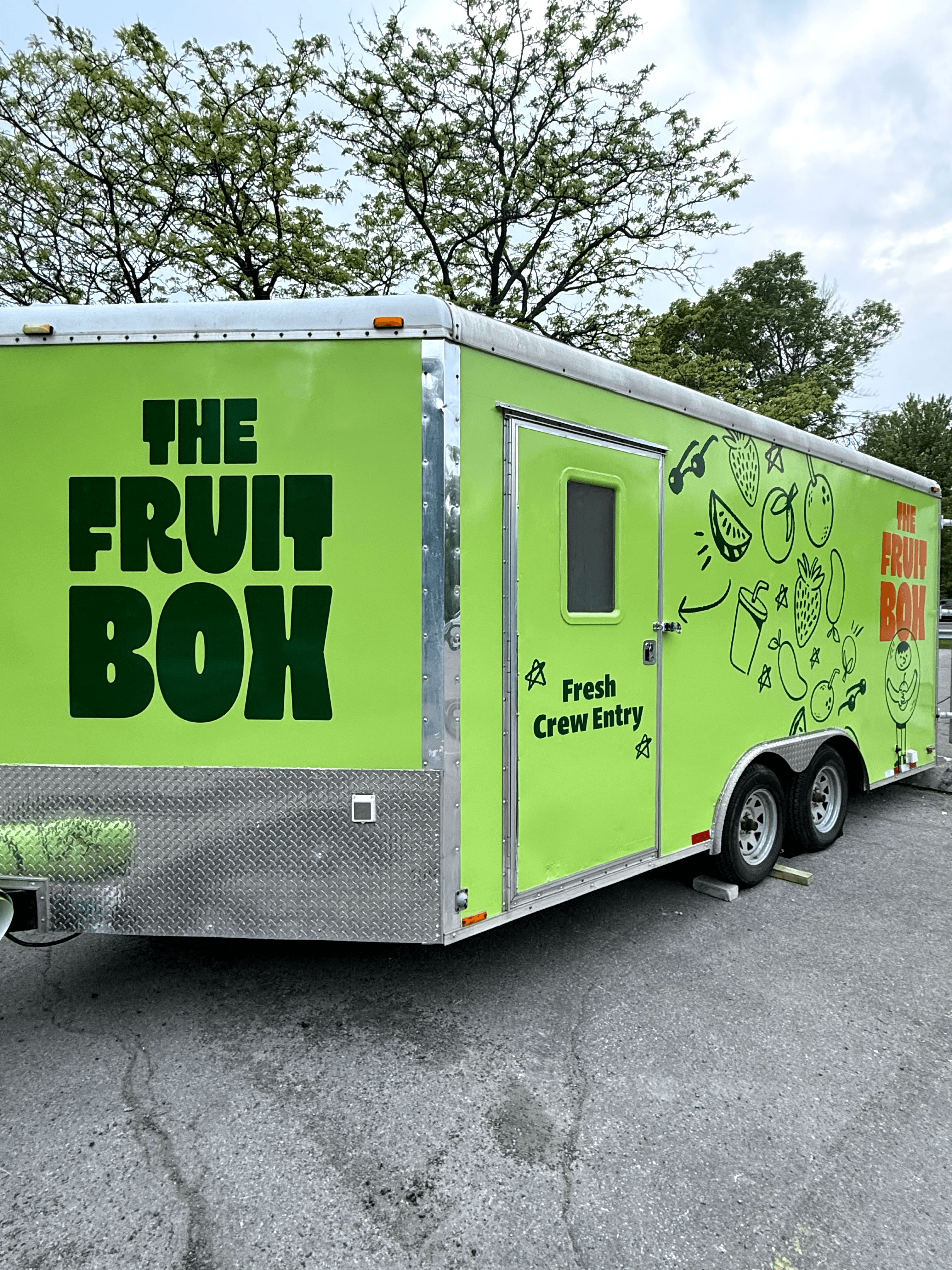
Woodbine Beach is packed with vendors and signage all summer. The Fruit Box needed to be visible and recognizable from a distance, without reading as a full restaurant or losing the impulse, grab-and-go feel that makes a beach stand work.
Approach
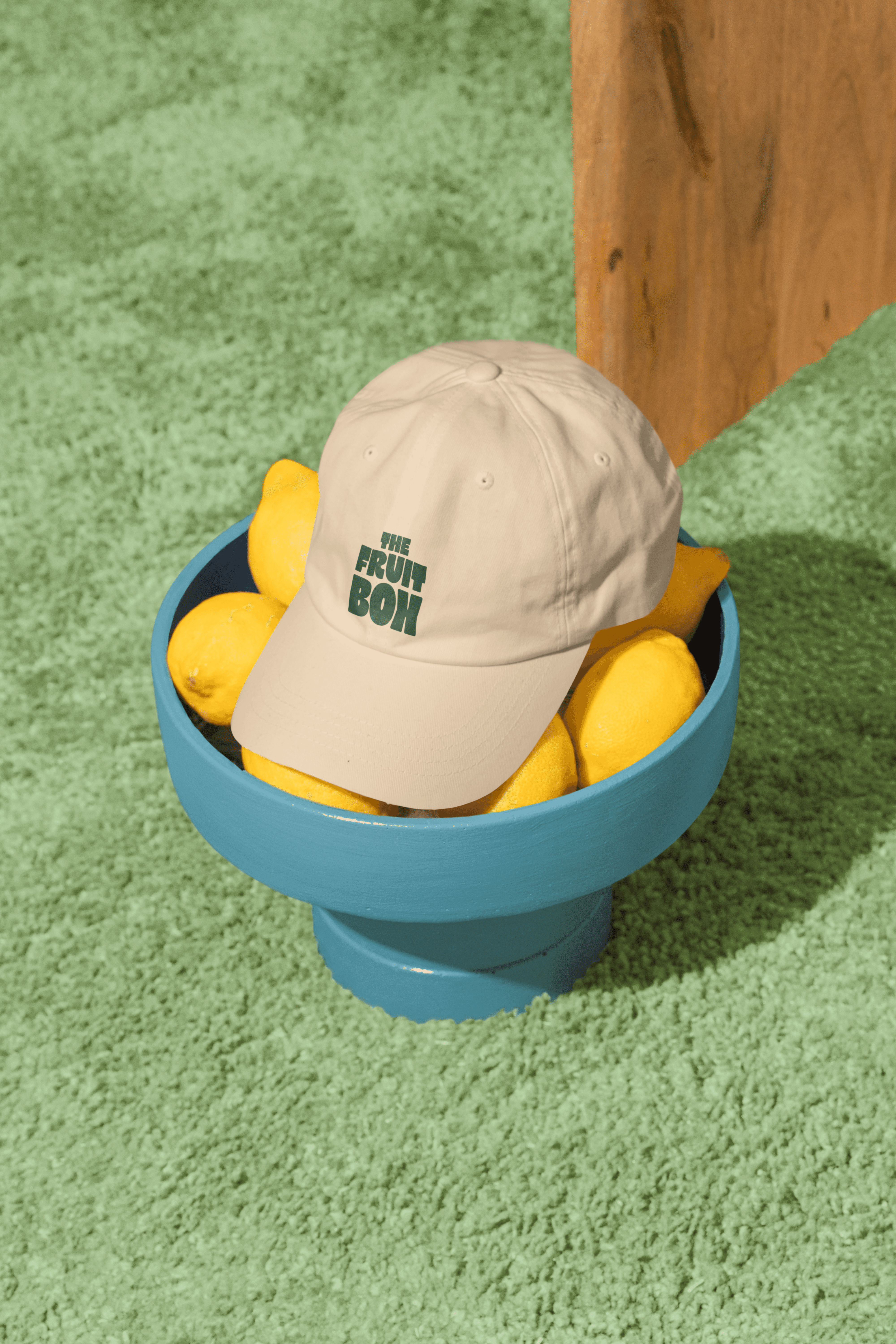
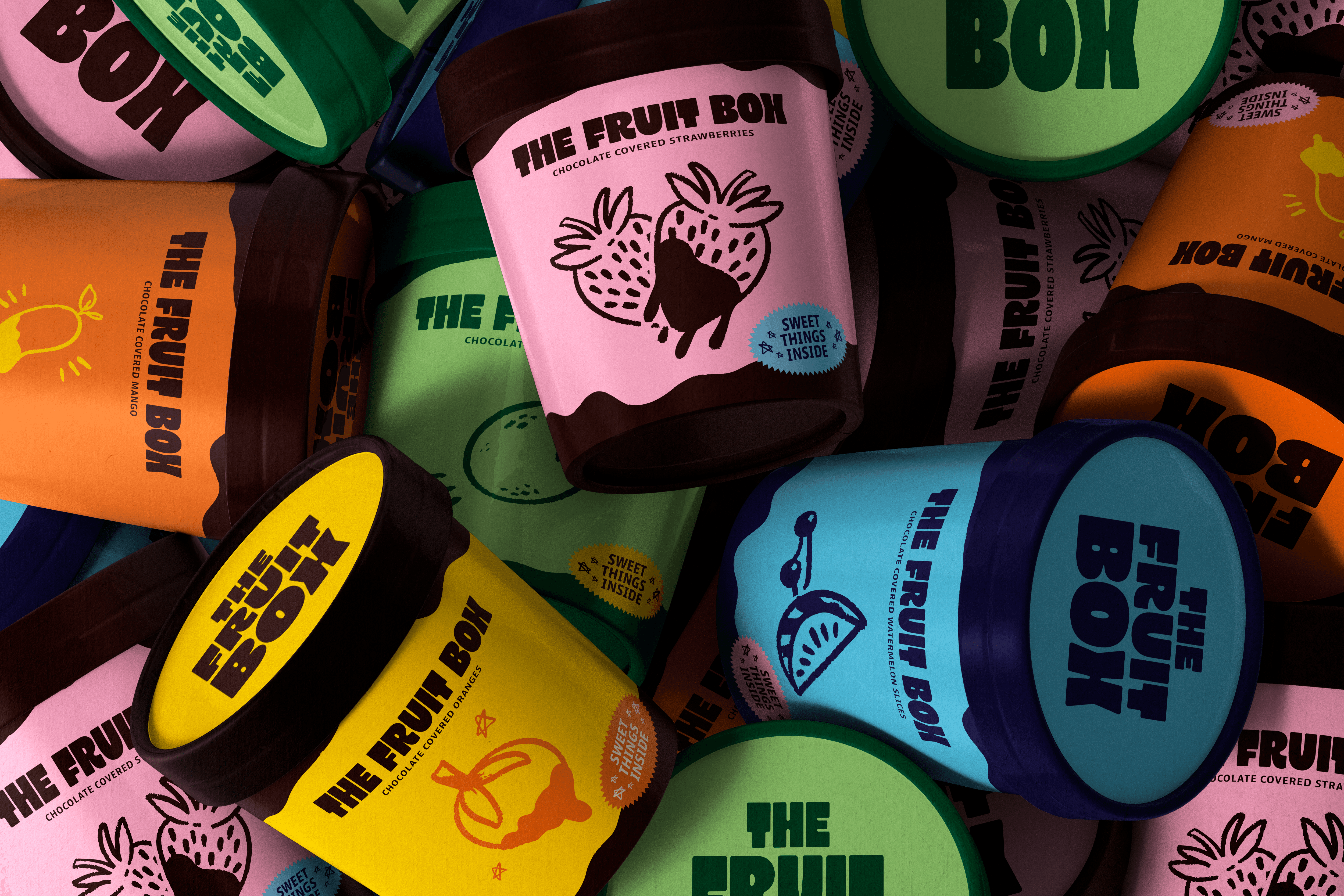
We leaned into bold, oversized type and hand-drawn fruit illustration rather than a polished, corporate mark. On a beach full of noise, a friendly, slightly rough-around-the-edges identity reads as approachable and fun instead of trying too hard to look premium. The green and orange palette was chosen to pop against sand, water, and sky, so the truck itself became the loudest piece of signage on the beach.