Curelux
Wellness
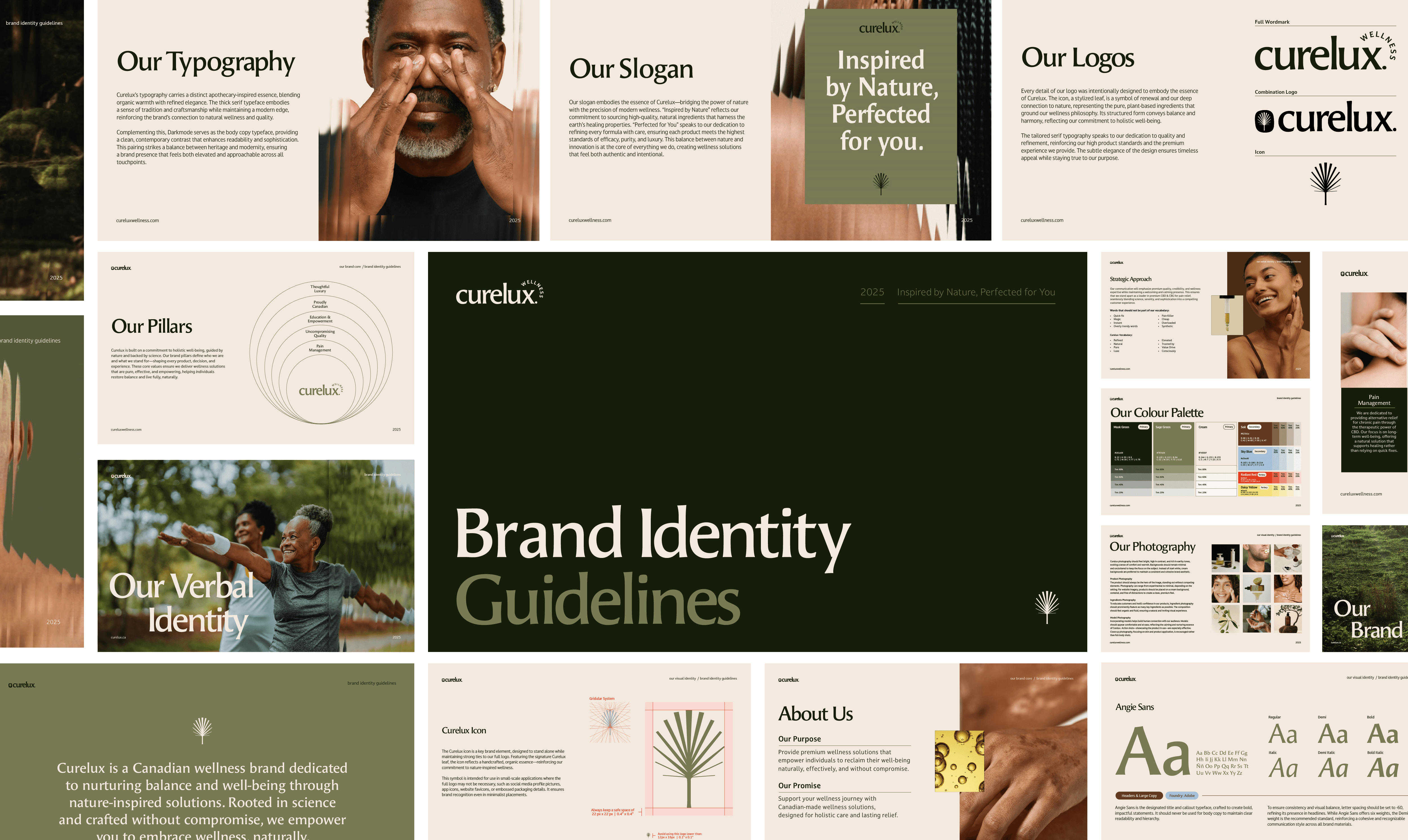
A refined identity for a premium CBD wellness brand, built to stand apart in a crowded market.
Context
Curelux is a Canadian wellness brand offering CBD products for natural pain relief. The brand needed a visual identity that could compete in a fast-growing CBD market without relying on the industry's usual visual shorthand.
the Challenge
The CBD landscape splits into two camps: clinical, affordable brands like CBD North, and elevated wellness players like Aesop and Saje that don't touch cannabis at all. Curelux needed to occupy the gap between them, premium enough to sit next to a skincare line, credible enough to be trusted for pain relief, without borrowing from either category's exact playbook.
Approach
We positioned Curelux as a wellness brand first, cannabis brand second. Every CBD brand fights the same instinct: lean into the leaf, the green, the dispensary look. We did the opposite, choosing a palm frond over a cannabis leaf, a muted natural palette, and refined typography that could sit on a shelf next to skincare, not signage. The goal wasn't to hide what the product is. It was to earn trust the way a wellness brand earns it, through restraint, not through category cues.